
Color Drenching Interior Design Ideas for a Calm Modern Home

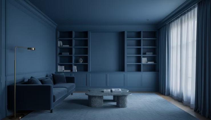
The first time I stepped into a fully color drenched room that truly worked, I didn’t think, “bold.” I thought, “calm.”
The walls and ceiling shared one quiet tone. The trim stopped interrupting the room. The furniture felt grounded instead of floating against a collage of edges. Nothing shouted for attention, yet the space had depth.
That is the real promise of color drenching. When handled well, it does not overwhelm a room. It removes friction.
In a modern home, color drenching works best when it feels architectural, not theatrical. The goal is fewer visual interruptions, better behavior from light, and furniture that has a real surface to push against. Paint becomes less of a decorative layer and more of a room-shaping material.
What color drenching means in interior design
Color drenching is an interior design technique where the walls, trim, ceiling, doors, molding, and sometimes built-ins are painted in the same color or closely matched tones. The room reads as one continuous envelope instead of a set of separate parts.
In a traditional paint scheme, contrast often does the work. White trim outlines the room. A white ceiling cuts across the top. Doors and moldings become bright borders. That can look crisp, but it can also make a small or awkward room feel busier.
Color drenching softens those breaks. It lets the architecture recede or unify, depending on the color and finish. Suddenly, a low ceiling feels less chopped off. A narrow hallway feels more purposeful. A room with uneven trim starts to feel intentional.
This does not mean every surface needs the exact same product or sheen. A successful drenched room often uses one color family with subtle finish changes. Matte walls, satin trim, and a slightly softer ceiling can all carry the same hue while giving the eye enough texture to stay interested.
Color Drenching Interior Design Ideas for a Calm Modern Home start with this mindset: the color is not the statement by itself. The statement is the mood it creates.
Why color drenching feels calm instead of chaotic
Many people assume a fully painted room will feel intense. Sometimes it does. But strong contrast can create more visual noise than strong color.
A white ceiling on dark walls pulls the eye upward. Bright baseboards draw lines around the floor. White window trim cuts holes into the wall plane. Each contrast creates a stop-start rhythm.
Color drenching reduces that rhythm. The eye moves more slowly. Furniture has a stronger backdrop. Art, lamps, books, stone, and wood become easier to notice because the room itself has stopped competing.
The calm comes from continuity.
That’s why color drenching often works beautifully in rooms used at night, such as:
Sitting rooms
Dining rooms
Bedrooms
Libraries
Powder rooms
Media rooms
Hallways with low natural light
A well-drenched room feels resolved, not decorated. Before choosing a paint color, think about how the room should behave.
Paint the ceiling
If the ceiling stays white, the room will still read in pieces.
This is the most common mistake. The walls may be rich and enveloping, but the white ceiling becomes a visual lid. In some rooms, that contrast works. In color drenching, it usually breaks the spell.
Painting the ceiling in the same color creates a true envelope. It can make a small room feel more complete and a large room feel more intimate. In rooms with crown molding, it also keeps the trim from turning into a bright outline.
If a full-strength ceiling feels too heavy, use a closely related tone that reads as part of the same family. The difference should feel like light passing over a surface, not like a new design idea.
Choose sheen with intent
When contrast disappears, finish becomes more important.
Sheen controls how a color catches light. A matte finish feels soft and powdery. Eggshell gives a little more movement. Satin can make trim and doors easier to clean while still staying close to the wall color.
For most modern homes, a balanced approach works well:
Surface | Finish that often works |
Walls | Matte or eggshell |
Ceiling | Flat or matte |
Trim and doors | Satin or low-luster enamel |
Built-ins | Satin for durability |
This keeps the room cohesive while giving each surface the performance it needs.
Test the color at night
Many drenched rooms reveal their best selves after sunset.
A color that looks calm at noon can turn flat under warm bulbs. A green that feels refined in daylight may become muddy at night. A blue that seems dramatic in the morning may become deeply peaceful under a shaded lamp.
Test large samples on more than one wall. Better yet, paint sample boards and move them around the room. Look at them in morning light, afternoon shade, and evening lamplight.
The night test matters because color drenching changes how light behaves. Wall color reflects onto the ceiling. The ceiling reflects back into the room. Lamps create pools of warmth against a continuous surface. The effect can be beautiful, but only if the color holds up after dark.

The best colors for a modern drenched room
Color drenching does not require dark paint. It works with pale, mid-tone, and saturated colors. The key is choosing a hue with enough complexity to live on every surface.
Flat, simple colors can feel harsh when wrapped around a room. Look for shades with a little gray, brown, black, or cream in the mix. These undertones help the color shift throughout the day.
Deep blue for a quiet sitting room
A muted navy, ink blue, or stormy blue can make a sitting room feel composed. Blue holds shadow well, so it works with velvet, blackened metal, walnut, and warm brass.
To keep deep blue modern, avoid overly nautical pairings. Skip bright white piping, rope details, and shiny chrome. Use soft black, dark wood, tobacco leather, parchment lampshades, and simple silhouettes.
Olive and moss green for a grounded living room
Green is one of the most forgiving choices for color drenching because it connects easily with natural materials. Moss, olive, eucalyptus, and lichen tones pair well with oak, travertine, linen, and aged leather.
A green drenched living room can feel restful without becoming sleepy. It also works well when built-ins are part of the room. Painting shelving, walls, and trim in one green tone allows books and objects to become the texture.
Warm taupe for a soft modern bedroom
Taupe, mushroom, and clay-gray shades are ideal for bedrooms where strong color feels like too much. When used across the ceiling, walls, closet doors, and trim, these shades create warmth without demanding attention.
Pair them with ivory bedding, smoked oak, boucle, plaster lamps, and linen curtains. The result feels calm but not plain.
Burgundy and brown for a dining room
Dining rooms can handle more depth. A brown-based burgundy, oxblood, or bitter chocolate can create an intimate space for evening meals.
The trick is restraint. Let the wall color do the enveloping, then keep the furnishings clean. A dark wood table, upholstered chairs, a simple pendant, and low art can be enough.
Plaster pink or muted terracotta for a powder room
Powder rooms are perfect for experimenting. They are small, enclosed, and often used in evening light.
A muted plaster pink, clay, or terracotta can feel warm and sculptural when continued across walls, trim, ceiling, and door. Add a stone sink, dark bronze faucet, and a simple mirror to keep the look modern.
Materials should carry the interest
A color drenched room should not rely on paint alone. Once the surfaces become quiet, materials need to do more of the work.
This is where the room gains depth.
Use materials with natural variation:
Walnut, oak, or ash
Leather with a soft grain
Velvet or mohair
Linen and wool
Travertine, marble, slate, or limestone
Ceramic lamps and hand-thrown vessels
Blackened steel or aged brass
These materials give the eye places to rest without breaking the atmosphere.
A blue room with a blue sofa, blue rug, and blue art may feel flat unless the textures shift. By contrast, a blue room with a walnut table, velvet chair, stone lamp, and wool rug has movement. The palette stays controlled, but the room breathes.
The best drenched interiors are layered, not busy. They use fewer visual ideas, but better ones.

How to make furniture work in a color drenched room
Color drenching changes the way furniture sits in a room. Against white trim and contrast-heavy walls, furniture can look separate from the architecture. Against a continuous color field, it feels more anchored.
That does not mean everything should match.
A calm modern room needs a clear relationship between the wall color and the main furniture pieces. You can create that relationship in several ways.
Use tonal furniture for a cocoon effect
Choose furniture in shades close to the wall color. A moss room with olive seating, a taupe bedroom with mushroom upholstery, or a blue library with smoky blue velvet will feel quiet and enveloping.
This works best when fabrics have texture. Velvet, linen, boucle, and wool catch light differently than painted walls, so the room still has dimension.
Use warm wood to balance cool colors
If the walls lean blue, green, or charcoal, wood brings warmth back into the room. Walnut is especially strong in color drenched spaces because it has depth without looking rustic. Oak works when the room wants a lighter mood.
Keep wood shapes simple. The more saturated the room, the more restraint helps.
Let one or two pieces create contrast
A drenched room can still have contrast. It just needs to be chosen, not scattered.
A cream sofa in a deep green room can look beautiful if the ceiling, trim, and built-ins stay unified. A black marble table can sharpen a plaster pink room. A rust velvet chair can warm a smoky blue den.
The problem comes when every element fights for contrast. White trim, black windows, patterned rug, bright art, metallic tables, and colorful pillows can break the calm quickly.
Where color drenching works best
Color drenching can work almost anywhere, but some rooms benefit more than others.
Small rooms
Small rooms often become more charming when painted fully. Instead of trying to make them feel bigger with white paint, color drenching makes them feel intentional. Powder rooms, dens, guest bedrooms, and small dining rooms are strong candidates.
Rooms with awkward architecture
Uneven trim, many doors, low ceilings, and strange transitions can become less noticeable when painted together. The color unifies the architecture and reduces the sense of clutter.
Rooms with built-ins
Built-ins become much calmer when they share the wall color. Shelves, cabinet doors, and trim stop looking like separate pieces and start feeling integrated.
Rooms used mostly in the evening
Media rooms, libraries, dining rooms, and bedrooms often benefit from deeper color because they are already about comfort, focus, and low light.
For open-concept spaces, be more careful. Color drenching can work, but the chosen color has to relate to several zones at once. In many homes, it is better to drench one defined area, such as a dining nook or lounge, rather than the entire main floor.
Common mistakes that make color drenching feel heavy
Color drenching can fail when the room depends only on paint for drama. The fix is usually simple.
The ceiling stays white.
The room feels unfinished because the top plane interrupts the effect.
The sheen is too glossy everywhere.
Too much reflection can make walls look slick rather than soft. Save higher sheen for trim, doors, and cabinetry when durability matters.
The color is chosen from a tiny paint chip.
A full room changes a color. Always test large samples.
The lighting is too cool.
Cool bulbs can make saturated rooms feel harsh. Warm, layered lighting usually works better.
The furnishings are too thin.
A drenched room needs pieces with visual weight. Tiny furniture can look lost against a strong envelope.
There are too many accent colors.
Color drenching already sets a mood. Accents should support it, not compete with it.
A simple plan for getting started
If you are curious but cautious, start with a room that has clear boundaries. A powder room, guest room, office nook, or small sitting room is easier than an open living area.
Follow this sequence:
Choose the mood first
Decide whether the room should feel quiet, intimate, earthy, dramatic, or soft.
Select three related paint colors
Test one lighter, one mid-tone, and one deeper option from the same mood family.
Paint large samples
Put them on different walls or movable boards. View them during the day and at night.
Plan the finishes
Use matte or eggshell for walls, flat or matte for the ceiling, and satin for trim or built-ins.
Edit the room materials
Bring in wood, stone, linen, leather, or velvet so the room has texture beyond color.
Layer the lighting
Use lamps, sconces, and dimmers where possible. Overhead light alone rarely flatters a drenched room.

The calm comes from commitment
Color drenching asks for commitment, but not chaos. It works because it takes away the small interruptions that make a room feel restless. The ceiling joins the walls. The trim stops shouting. The furniture gains a stronger backdrop. Light moves across the room in a more continuous way.
The most successful version feels modern, architectural, and livable. It does not chase drama for its own sake. It creates a room that feels settled when life is ordinary and the light is low.
Start with one enclosed space. Paint the ceiling. Test at night. Let materials carry the interest. If the room feels quieter, warmer, and more complete, the color is doing more than decorating. It is shaping the mood.


Comments