
Mastering Spatial Awareness in Interior Design

Some rooms feel calm the second you walk in. Others look expensive, even beautiful, yet still feel cramped, cold, or strangely uncomfortable. The difference often comes down to something you cannot buy in a showroom: the way space is handled.
Spatial awareness is the skill of understanding how furniture, architecture, light, movement, and empty space work together. It is the invisible layer that makes a home feel natural to live in. A room can have the right sofa, the right rug, and the right paint color, but if the spacing is wrong, the whole design feels off.
For new homeowners and buyers, this skill is especially useful. It helps you see beyond finishes and imagine how a room will actually function. It also helps you avoid filling a new home too quickly, before you understand how each space wants to be used.
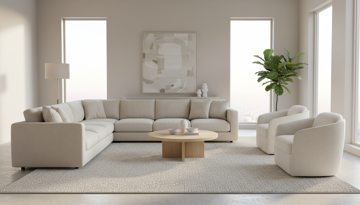
Let negative space do real work
One of the easiest mistakes to make in a new home is filling every wall, corner, and surface. Empty space can feel unfinished at first, especially after moving from a smaller apartment or trying to make a new house feel complete. But empty space is not wasted space. In design, it is called negative space, and it gives a room its shape.
Negative space allows the eye to rest. It helps important pieces stand out, from a velvet sofa to a sculptural lamp to a large piece of art. When every surface has something on it, nothing feels special. The room becomes visual noise.
A good way to test negative space is to remove one thing at a time. Take away a side table, a floor basket, or a small chair that rarely gets used. Then stand at the doorway and look again. If the room suddenly feels more open and intentional, that piece was interrupting the space.
This does not mean a room should feel bare. A well-designed room can be layered and cozy. The goal is to create contrast between full areas and open areas.
A few examples help:
A large sofa can feel more elegant when the wall behind it is mostly clear.
A beautiful coffee table looks better when it is not covered edge to edge.
A corner does not always need a plant, basket, lamp, or chair.
A strong piece of art often needs blank wall around it to breathe.
One practical trick is to pull furniture slightly away from the walls. Even a few inches can create a shadow line that makes the room feel deeper. In larger rooms, floating a sofa or pair of chairs can create a more intimate seating area and keep the perimeter from feeling stiff.
Empty space is not the absence of design. It is part of the design.
Plan for movement before you place furniture
A beautiful room fails if it is awkward to walk through. Traffic flow is one of the clearest signs that a space has been planned well. People should be able to move through a room without turning sideways, stepping around corners, or bumping into furniture.
Start by identifying the natural paths in the room. These are the routes from one doorway to another, from the kitchen to the dining table, from the sofa to the patio door, or from the bed to the closet. Once you see those paths, keep them clear.
In a living room, the main walkway should not cut directly through the center of the conversation area if there is another option. In a bedroom, the bed should not block closet doors or force a tight squeeze around a dresser. In a dining room, chairs need enough room to pull out comfortably.
A useful rule is to leave about 30 to 36 inches for main walkways where possible. Smaller pass-through areas can sometimes work with less, but the room should still feel easy to use. Around dining chairs, give extra space behind each seat so people can sit down and stand up without scraping walls or cabinets.
Traffic flow matters even more in open-concept homes. Without walls to define rooms, furniture placement becomes the guide. A sofa can create a boundary between a living area and dining area. A rug can signal where a seating zone begins. A console table behind a sofa can separate spaces without blocking light or views.

Before buying new furniture, use painter’s tape to mark the footprint on the floor. Tape out the sofa, dining table, bed, or console you are considering. Then walk around it for a few days. If the taped shape annoys you, the real piece will too.
Choose pieces that match the scale of the room
Scale is about size in relation to the whole room. Proportion is about how pieces relate to each other. Both matter.
A sofa that looked perfect in a store can overwhelm a small living room. A tiny coffee table can look lost in front of a deep sectional. A delicate nightstand may feel strange next to a tall upholstered bed. These mismatches create tension, even if each item is attractive on its own.
The architecture of the room gives you clues. High ceilings can handle taller bookcases, larger art, and more substantial light fixtures. Low ceilings often need lower furniture, slimmer profiles, and vertical lines that draw the eye upward. Large windows may call for pieces with enough visual weight to balance them. A compact room usually benefits from furniture with exposed legs, lighter colors, and clean silhouettes.
Rugs are a common scale problem. A too-small rug can make a living room feel like the furniture is floating apart. In many seating areas, the rug should be large enough for at least the front legs of the sofa and chairs to sit on it. In a bedroom, the rug should extend beyond the sides and foot of the bed so it feels connected to the furniture rather than tucked under as an afterthought.
Lighting also needs proper scale. A tiny pendant over a large dining table looks accidental. A large chandelier in a low-ceilinged room can feel oppressive. The right fixture should relate to the table, ceiling height, and surrounding furniture.
When in doubt, measure. Then measure again. Designers do not rely on hope. They check dimensions, clearances, door swings, and ceiling heights. A tape measure is one of the simplest tools for better interior design.
Create zones that match real life
Every room has a purpose, but many rooms have more than one. A living room might support conversation, TV watching, reading, storage, and play. A bedroom might also need a small seating area or a work-free routine zone. A kitchen may include cooking, dining, homework, and casual gathering.
Spatial planning works best when each activity has a clear place.
In a living room, a conversation zone can be built around a sofa and two chairs facing each other. A reading zone might sit near a window with a comfortable chair, small table, and lamp. A media zone should account for viewing distance, glare, and comfortable seating angles.
In an open floor plan, zones prevent the room from feeling like one large furniture warehouse. Rugs, lighting, and furniture backs can create subtle boundaries. These boundaries make the space easier to understand.
Try this exercise before rearranging a room:
Write down the activities that actually happen there.
Circle the activities that happen every day.
Remove furniture that serves a fantasy version of the room.
Arrange the most-used activities first.
Add decorative pieces only after the layout works.
That fourth step is key. A formal chair no one sits in may look nice, but it can block the layout. A large cabinet may offer storage, but if it narrows the main path, it creates daily friction. Rooms should support the way people live, not just the way a floor plan looks online.

Balance visual weight across the room
Not all furniture carries the same visual weight. A dark leather sofa feels heavier than a pale linen one. A solid wood cabinet feels heavier than a glass coffee table. A tall bookcase pulls more attention than a low bench. Visual weight affects how stable or lopsided a room feels.
If all the heavy pieces sit on one side, the room may feel unbalanced. This can happen when a sectional, media console, and tall shelving unit all line one wall, while the opposite side has only a small chair. The fix is not always symmetry. It is balance.
You can balance a heavy sofa with a pair of chairs, a large plant, a substantial floor lamp, or a gallery wall. You can balance a dark cabinet with a darker rug pattern or a strong piece of art across the room. You can soften a bulky bed with lighter nightstands and simple bedding.
Color plays a role too. Dark colors advance visually, while light colors recede. A black accent chair will command more attention than the same chair in ivory. Bright colors also carry weight, especially in calm rooms. Use them with intention.
Texture matters as well. A chunky woven rug, stone table, or heavy drapery can add weight without adding strong color. Reflective pieces, such as mirrors and glass tables, feel lighter because they bounce light and reduce visual bulk.
Stand in each doorway and check the room from that viewpoint. Doorways are how most people experience a space for the first time. If one corner feels overloaded, shift weight elsewhere.
Respect the architecture instead of fighting it
Each home has fixed features that shape the layout: windows, doors, fireplaces, ceiling beams, built-ins, staircases, and views. Good design works with these features instead of pretending they are not there.
A fireplace often wants to be a focal point, but it does not always need to be the only one. A room can have a fireplace zone and a TV zone if the furniture placement supports both. Windows need breathing room so natural light can enter freely. Door swings need space. Built-ins should feel integrated, not crowded by extra storage pieces placed nearby.
Older homes may have smaller rooms, radiators, narrow entries, or off-center windows. Newer homes may have large open areas, tall ceilings, or long blank walls. Neither is better by default. Each simply asks for a different spatial response.
For long rooms, break the space into two or three zones instead of pushing everything to the walls. For square rooms, create a centered seating group so the space feels grounded. For rooms with awkward corners, avoid forcing furniture into every angle. Sometimes the best solution is to let an odd corner stay quiet.
This is especially helpful when touring a home to buy. Look past paint colors and staging. Ask yourself:
Where would the main walkway be?
Can the room hold the furniture you already own?
Do windows and doors limit placement?
Is there a natural focal point?
Does the space support daily routines?
A room that looks empty during a showing can feel very different once furnished. Thinking spatially helps you spot both potential and problems early.
Use light to shape the feeling of space
Light changes how large, open, cozy, or compressed a room feels. A dark corner can make a room feel smaller. A single overhead fixture can flatten everything. Layered lighting adds depth and helps zones feel distinct.
Most rooms benefit from three types of light:
Ambient light
Task light
Accent light
The general light that fills the room, often from ceiling fixtures or recessed lighting.
Focused light for reading, cooking, grooming, or working on a specific activity.
Light that highlights art, shelves, plants, or architectural features.
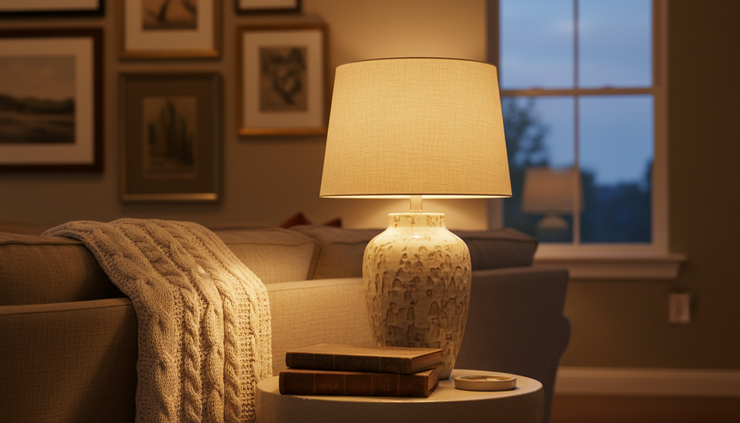
A living room with only a ceiling light can feel harsh at night. Add table lamps, floor lamps, or sconces, and the same room feels more layered. A bedroom with lamps on both sides of the bed feels more balanced than one with a single bright overhead fixture. A hallway with a mirror and soft wall light can feel wider and more welcoming.
Natural light deserves the same care. Avoid blocking windows with bulky furniture. Hang curtains wider than the window frame when possible, so the fabric can stack outside the glass and let in more light. Mirrors can help reflect daylight, but place them where they reflect something pleasant, such as a window, artwork, or greenery.
Edit the room until it feels calm
After furniture is placed, the final step is editing. This is where a decorated room becomes a designed room.
Editing does not mean removing personality. It means giving each piece a reason to be there. The best rooms often include personal objects, books, art, family pieces, and travel finds. They feel collected. The difference is that those items have space around them and a clear relationship to the room.
Use this simple editing method:
Take photos of the room from all four corners.
Look at the photos instead of the room itself.
Notice crowded surfaces, blocked paths, and uneven walls.
Remove or move one item at a time.
Live with the change for a day before adding anything back.
Photos help because they flatten the room. Problems become easier to see. A chair that interrupts a walkway, a lamp that is too small, or a wall that feels too busy may stand out immediately.
Pay special attention to surfaces. Coffee tables, consoles, countertops, and open shelves often collect too much. Leave open space between objects. Group smaller items so they read as one collection rather than scattered clutter. Repeat materials or colors in small ways to connect different areas.
A calm room is not necessarily minimal. It is clear. The furniture fits. The paths make sense. The eye knows where to go. The empty space supports the full space.
The best rooms feel easy before they look impressive
Mastering space is less about rules and more about awareness. Notice where people walk. Notice where the eye rests. Notice which corners feel heavy, which surfaces feel crowded, and which pieces make daily life harder than it needs to be.
When a room feels balanced, people may not comment on the clear walkway, the right-sized rug, or the quiet wall behind the sofa. They will simply feel comfortable. That is the invisible art of good design.
Start with one room. Remove what crowds it, measure what matters, protect the paths, and let the strongest pieces breathe. The result will feel more natural, more useful, and far more designed.


Comments